FOUR CORNERS LOOP TRAIL ASSOCIATION
FCL Home
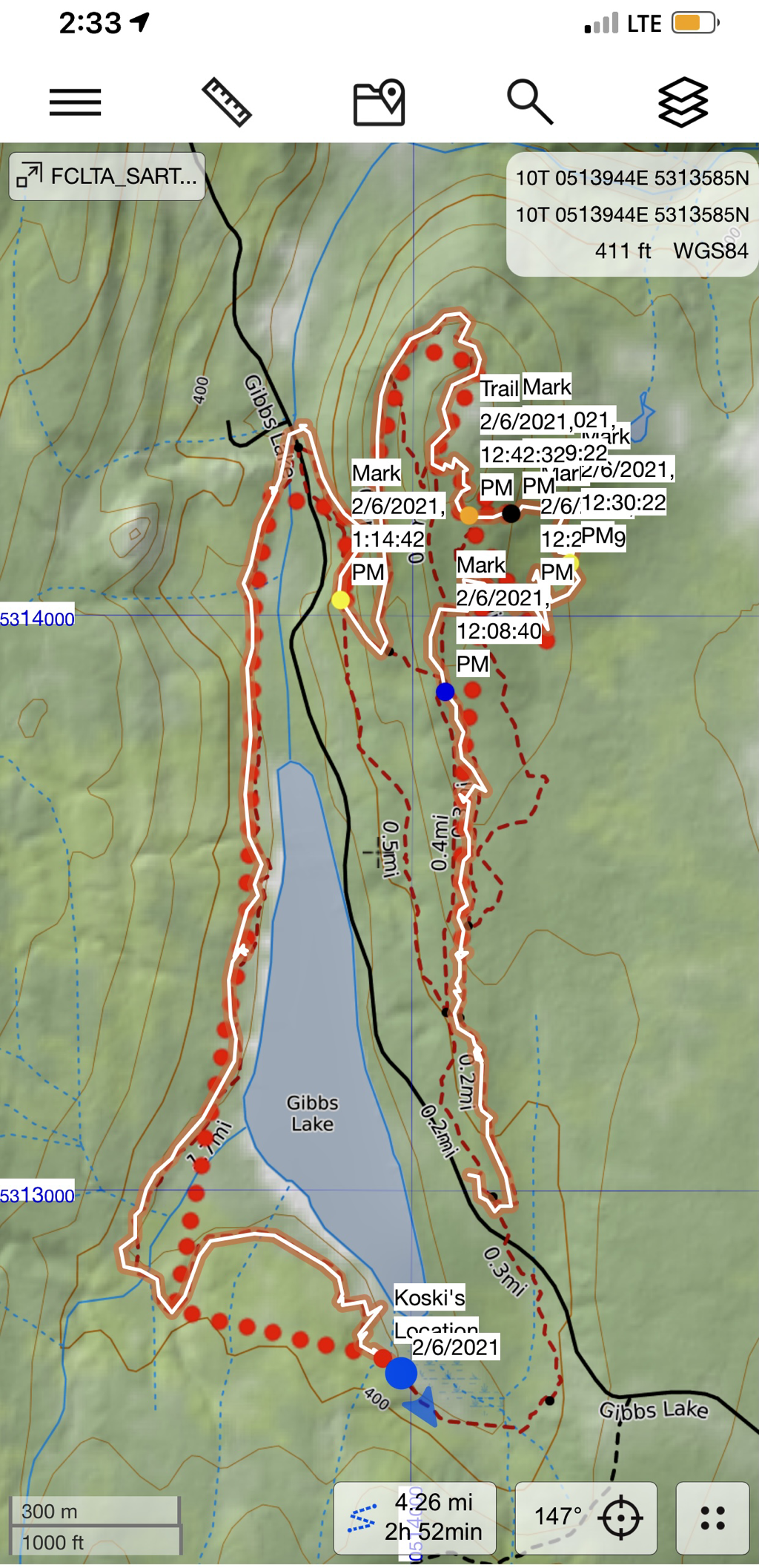
The Route
Map
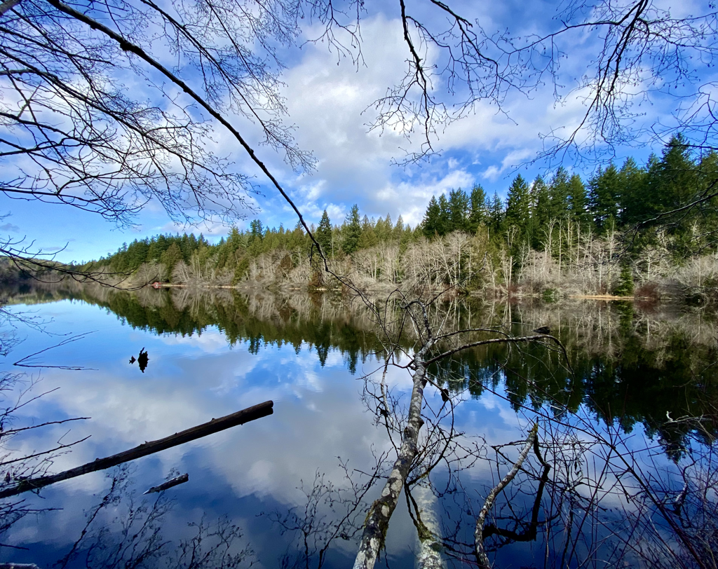
Pictures
Trail Development
New Mexico Route Development
Arizona Route Development
Utah Route Development
Colorado Route Development
Blog - Notes from the Trail
Contact / Social Media
FCL Home
The Route
Map
Pictures
Trail Development
New Mexico Route Development
Arizona Route Development
Utah Route Development
Colorado Route Development
Blog - Notes from the Trail
Contact / Social Media